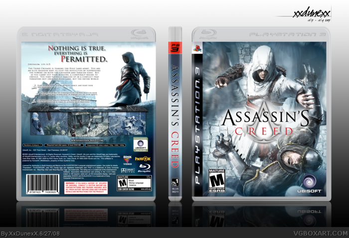
you beat me to it. wow. well this is my fourth box, and first one 5 months. now i made a different version of this but it was horrible so i didnt bother, now i changed it drastically and im glad how it turned out. now the front cover, yes, its plain and just concept but that's really all boxes tend to be, or else they don't look to great. enjoy!
I love the whole AC concept (the game) that Altair is this lonely soul. The original boxart and the advertising has been focused on this kind of way of thinking (youtube on "lonely soul" and you'll see), so even though I can look on this boxart and like the way everything is placed and edited, this doesn't fit in extremely well with the AC concept since Altair isn't lonely and spcial on the front. But still a nice boxart, that would have given me shivers if it wasn't because of AC's style.
#24 - dont worry, i get exactly what you are talking about and i can agree with that. now one reason why i didnt do it that way, is because then it would be so similar to so many of the other boxes. i hate having a box with similar parts, cuz then people will think, "oh man, he took that from this box" or something. and another reason is just that it seams cheap using the same cover art as it is on the official. its fine that you gave me 3/5, everyone has their own take on things.
Congrats on Hall, dude! I must've missed this box when you first posted it up.
It's an amazing box. The front, while the pic has been used multiple times before, is really great because of the quality and the logo itself, which looks sweet with that white glow around it.
The back is just fabulous, it's laid out perfectly, and you've just proven that a back cover packed with text and pics doesn't make it good.
+fav
 Assassin's Creed Box Cover Comments
Nice.
[ Reply ]
Two words: wow! & wee! Faved.
[ Reply ]
you beat me to it. wow. well this is my fourth box, and first one 5 months. now i made a different version of this but it was horrible so i didnt bother, now i changed it drastically and im glad how it turned out. now the front cover, yes, its plain and just concept but that's really all boxes tend to be, or else they don't look to great. enjoy!
[ Reply ]
You did an awesome job ! faved
[ Reply ]
back is just GEEEEE-REAT!
oh yeah, i +faved.
[ Reply ]
thanks
[ Reply ]
this is fucking sick
[ Reply ]
thank you, thank you
[ Reply ]
pwntastic my friend. you earned a fav =)
[ Reply ]
you're back :)
nice one.
[ Reply ]
AWESOME.
[ Reply ]
thanks for the favs everyone..keeep them coming =P
[ Reply ]
Who are you?
Whoever you are...YOUR EFFING BRILLIANT
[ Reply ]
I love it.
[ Reply ]
This is official quality. Fantastic. The back is excellent, and the overall design is great. I really like this box. +Fav, keep it up man
[ Reply ]
Looks like this is going to be in the HOF hopefully my RE 5 box will be in there with it
[ Reply ]
Awesome 5/5.
[ Reply ]
20th fav. ! I meant : Hall of fAme !
[ Reply ]
i hope this gets in the hall
[ Reply ]
This is one of the most official looking box on the site. Hall material all the way!
[ Reply ]
wow, thanks everyone.
i hope this gets in the HoF as well, will be my first, and hopefully not last.
[ Reply ]
Hof ! Congratulations !
[ Reply ]
What a way to come back
[ Reply ]
I love the whole AC concept (the game) that Altair is this lonely soul. The original boxart and the advertising has been focused on this kind of way of thinking (youtube on "lonely soul" and you'll see), so even though I can look on this boxart and like the way everything is placed and edited, this doesn't fit in extremely well with the AC concept since Altair isn't lonely and spcial on the front. But still a nice boxart, that would have given me shivers if it wasn't because of AC's style.
3/5 (Plz don't flame me)
[ Reply ]
#22 - thanks a bunch.
#24 - dont worry, i get exactly what you are talking about and i can agree with that. now one reason why i didnt do it that way, is because then it would be so similar to so many of the other boxes. i hate having a box with similar parts, cuz then people will think, "oh man, he took that from this box" or something. and another reason is just that it seams cheap using the same cover art as it is on the official. its fine that you gave me 3/5, everyone has their own take on things.
[ Reply ]
#24, so just because it doesn't fit in well with the lonely sole concept you think it deserves a 60%?
Thats a bit hypocritical.
[ Reply ]
#26, Well that's my opinion.
#25. Danke. :)
[ Reply ]
F'n A man! Woo! I so need to re-do mine! lol. I made mine AGES ago, back where there was hardly any media to work with!
[ Reply ]
This is very nice if a bit archaic.
[ Reply ]
I like the style. great job :)
[ Reply ]
#29, You're back?
[ Reply ]
wicked, i love the front cover and so is the back - it does look pretty offical cover. fav. well done getting into the hall of fame
[ Reply ]
Pretty tight.
[ Reply ]
thanks
[ Reply ]
I'm currently working on my own AC box.
Hope it's half as good as this!
[ Reply ]
Congrats on Hall, dude! I must've missed this box when you first posted it up.
It's an amazing box. The front, while the pic has been used multiple times before, is really great because of the quality and the logo itself, which looks sweet with that white glow around it.
The back is just fabulous, it's laid out perfectly, and you've just proven that a back cover packed with text and pics doesn't make it good.
+fav
[ Reply ]
#36, "you've just proven that a back cover packed with text and pics doesn't make it good."
Sounds a bit insulting to me. :p
[ Reply ]
one word
perfect
[ Reply ]