woah, this is...awesome! those screens on the back are the best part. the only thing i would suggest would be to center the logo and make it bigger. anyway 5/5+fav
pretty good. my only gripe is that the horrible cut logo kinda spoiled it for me as well as the repeating image in the back. otherwise, this is nice and I'm looking forward for more boxes from you :)
#7, do you live under a rock? Or are you joking? xIamHunterx got banned and xStormthegatedofhellx is his his alt. They're the same guy. But I am really impressed with this box. Nice job.
 The Darkness Box Cover Comments
Whee.
[ Reply ]
woah, this is...awesome! those screens on the back are the best part. the only thing i would suggest would be to center the logo and make it bigger. anyway 5/5+fav
[ Reply ]
*double pump*
[ Reply ]
Good job! :)
[ Reply ]
pretty good. my only gripe is that the horrible cut logo kinda spoiled it for me as well as the repeating image in the back. otherwise, this is nice and I'm looking forward for more boxes from you :)
[ Reply ]
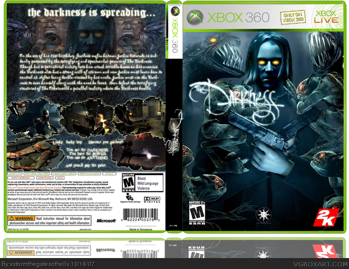
The logo does look pretty bad... I added an outer glow to it, but I guess that doesn't do a lot for it...
Added a wind effect to the two Jackies. Hope you likey.
Hey, this is the most faves I've ever had... yay.
[ Reply ]
i still love those screens lol your name reminds of that xiamhunterx guy....im looking forward to more from you to.
[ Reply ]
#7, do you live under a rock? Or are you joking? xIamHunterx got banned and xStormthegatedofhellx is his his alt. They're the same guy. But I am really impressed with this box. Nice job.
[ Reply ]
#8 i was joking...no1 puts the x's in there name so quickly afterward. it would have to be him....but it seems he improved very fast.
and its a stone, not a rock
[ Reply ]
#7, I lol'd.
#8, I also lol'd. But I get my original account back tonight, sooo...
[ Reply ]
wow. Bans don't last very long...
[ Reply ]
Yeah, no kidding.
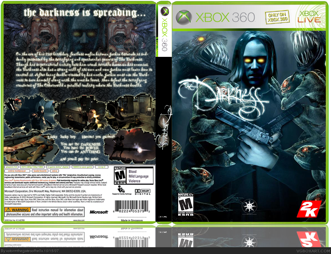
Updated again, this time with a better cut logo.
[ Reply ]
i think the front cover is a bit over crowded.
the logo (the darkness)i think needs to be centred and moved the bottom of front cover.
[ Reply ]
I doubt that I'm going to move the logo... I like it where it is because it's not covering up anything important.
[ Reply ]
Edited at 1 decade ago
[ Reply ]
Some comments, maybe...?
[ Reply ]
looks much better. great job ;)
[ Reply ]
...I... I feel so proud... ^___^
[ Reply ]
I hate my laptop. Stupid double posts...
Edited at 1 decade ago
[ Reply ]
*looks around*
[ Reply ]
dood, i never think ive seen such a good first box before.
[ Reply ]
#21, that's because it's not a first box.
i'd expect a darkness box to be alot.. darker, but it's great nonetheless.
[ Reply ]
#21, Haha thanks... But like Ayron said, it's not my first. But thanks anyway.
Ayron: Thank you very much, sir. *bows*
[ Reply ]
o___O I'm six faves away from being Hall eligible...
[ Reply ]
Umm, don't you mean 15? You need 20 to be in the Hall of Fame.
[ Reply ]
Eh? I thought I read that it was only 13... Oh well.
[ Reply ]
Dude, you can't fav your own box. It's cheating.
[ Reply ]
take that fav off man, don't be such a cheater. play fair.
[ Reply ]
Alright... *sigh*
[ Reply ]
The funny thing is, I didn't think this was THAT great, and it has more faves than my favorite box that I've done.
[ Reply ]
So... No other suggestions? Guess it's time to let this one go, then...
[ Reply ]
#30, is this your highest amount of faves?
ZOMG!
+Fav
[ Reply ]
Yep! Thank ye for the fave, my compatriot! *sweeping theatric bow*
[ Reply ]
Hey, you never faved it...
[ Reply ]
*beats you*
[ Reply ]
I never expected this box to do so well.
[ Reply ]
And now it's dead. Damn.
[ Reply ]
Personaly I dont like the blue-ish glow, I would have change it to a red or dark color. Other than that its nice-5/5
[ Reply ]