[ Buy Assassin's C... at Amazon ] By DeathSpawn11 47 on September 29th, 2007 No Printable Available Assassin's Creed Box Cover Comments Comment on DeathSpawn11's Assassin's Creed Box Art / Cover. Cancel Reply DeathSpawn11 47 [ 1 decade ago ] cred to Crayon man for the temp. EDIT: and if you haven't noticed, I've been on a boxart spree lately. my 360 is in for repairs and I've been really bored lately. so until my 360 is back.... Edited at 1 decade ago [ Reply ] Radioactive Bob 38 [ 1 decade ago ] Well, something good came out of your broken 360. :P This is really good, the front feels a bit empty though. But the back is great. [ Reply ] Ninjamojo27 37 [ 1 decade ago ] I think it should be collectors edition by the front. [ Reply ] ELCrazy 50 [ 1 decade ago ] I really love the simplicity of it. I don't think fav-ing this would hurt :p [ Reply ] KILLERMIKE 5 [ 1 decade ago ] #1, ill fave if ya tell me how you got the front blue like that with those abstract designs.also how do you get the lines on the ubi logo? [ Reply ] Roboross 31 [ 1 decade ago ] Your backs are starting to look the same. But it's nice. [ Reply ] Iron Man 14 [ 1 decade ago ] You ACTUALLY made an over used picture look really good! 5/5 +Fav [ Reply ] DeathSpawn11 47 [ 1 decade ago ] #5, don't bribe people to learn their techniques. but that reminds me to credit Mist for the Ubi lines. Edited at 1 decade ago [ Reply ] KILLERMIKE 5 [ 1 decade ago ] #8, nvm its awesome anyway-still a fave. [ Reply ] Tikicobra 3 [ 1 decade ago ] #7, This isn't the overused picture... [ Reply ] vi3tmix 6 [ 1 decade ago ] It's nice. Very simple but it somehow fits the subject pretty well. Edited at 1 decade ago [ Reply ]
 Assassin's Creed Box Cover Comments
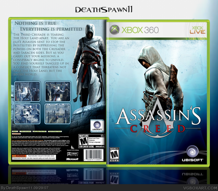
cred to Crayon man for the temp.
EDIT: and if you haven't noticed, I've been on a boxart spree lately. my 360 is in for repairs and I've been really bored lately. so until my 360 is back....
Edited at 1 decade ago
[ Reply ]
Well, something good came out of your broken 360. :P
This is really good, the front feels a bit empty though. But the back is great.
[ Reply ]
I think it should be collectors edition by the front.
[ Reply ]
I really love the simplicity of it.
I don't think fav-ing this would hurt :p
[ Reply ]
#1, ill fave if ya tell me how you got the front blue like that with those abstract designs.also how do you get the lines on the ubi logo?
[ Reply ]
Your backs are starting to look the same.
But it's nice.
[ Reply ]
You ACTUALLY made an over used picture look really good! 5/5 +Fav
[ Reply ]
#5, don't bribe people to learn their techniques.
but that reminds me to credit Mist for the Ubi lines.
Edited at 1 decade ago
[ Reply ]
#8, nvm its awesome anyway-still a fave.
[ Reply ]
#7, This isn't the overused picture...
[ Reply ]
It's nice. Very simple but it somehow fits the subject pretty well.
Edited at 1 decade ago
[ Reply ]